MAKE A MEME
View Large Image

| View Original: | Better_design_needed_for_Supermarket's_Aisle_Layout_Brochure_2.jpg (768x1024) | |||
| Download: | Original | Medium | Small | Thumb |
| Courtesy of: | www.flickr.com | More Like This | ||
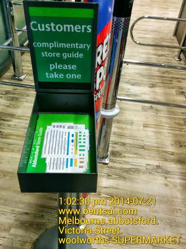
| Keywords: Which aisle guide design is clearer and ergonomic? current design of supermarket or my proposed design using simple MS EXCEL software. Optional: use color theory to make the "O" or "P" (leading alphabet) to be of a different colour than the product name but contrast well with the background. Are there instructions to instruct customers to circle the product name that they want to buy on the brochure, and to write and group the aisle no. that they need to go to in a white space on the brochure? Are there instruction to encourage customers to bring the brochure home for them to plan ahead instead of wasting paper to write their own grocery list? --------------------------------------------------------------------------------- Revised design part 2 to save printing and paper cost if this brochure idea to be implemented globally: retail melbourne australia | ||||